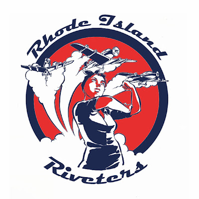
 I decided today I know much less about Adobe programs than I thought. I may need to take another class or two. Hopefully this will be good enough for the screen printers! Sigh. I'm an okay artist, but a terrible designer. I think I'm getting dumber as time goes by.
Tuesday, March 31, 2009
Red, White, BLUE, Hello!
 I decided today I know much less about Adobe programs than I thought. I may need to take another class or two. Hopefully this will be good enough for the screen printers! Sigh. I'm an okay artist, but a terrible designer. I think I'm getting dumber as time goes by.
Thursday, March 19, 2009
Ancient Rome... It's Not Like Home!!!
Tuesday, March 10, 2009
Derby 2009
 OK, so- Above is my submission for the 2009 season schedule poster. I have since figured out with the help of a friend or two that Roman numerals, while cool-looking and theme-appropriate, will look like gibberish to most people. I have to say at first glance, I'd think it was weird too. The other issue is that instead of four bouts like in my design, there are eight. Would it look the same if there were eight diagonal comet tails attached to the PRD logo? Could you even read them? Ugh. Graphic design is hard.
 The next is my proposal for a new Riveters logo. Personally I would keep the old logo- I'm not saying that because I did it... In fact, most of the stuff I did from 2004-05 in terms of branding and logos for PRD are kind of embarrassingly rough. What I really mean is that consistency is the key to establishing an identity. I think that changing the logos every couple of years or so does nothing to establish branding but in fact does the opposite. We'll look like a league that's amorphous and has not only an identity crisis but a high turnover rate. Dukes posted something on the forum a while back to the effect of: Keeping the original logos acknowledges that PRD was here before us and will be here after we're gone. While it's true that an organization is defined by the people who comprise it, I think she's right. As a founding member I'd like to think that the growing pains, difficulties, heartache, and hard work we went through to establish ourselves left a legacy for future skaters. The aesthetic should reflect this also.
Anyway, If I had to do a new logo, the sketch above is the direction in which I'd take it. Once more I've given the Riveters a logo without a single roller skate on it. Partly it's because these logos are almost always used in the context of roller derby and are recognized by the derby world at large and don't need a pin-up girl on skates to drive the point home. I don't want our league to be represented by another pin-up girl on skates. Riveters helped the war efforts by working in munitions and airplane manufactories. That is why the original logo has smokestacks and an airplane. The woman represented in my sketch is not a sex symbol- She's a worker and she made those goddamn planes. My grandmother was a riveter for a short period of time during the war and I'm pretty sure she didn't do it for the outfit.
Saturday, March 7, 2009
Subscribe to:
Posts (Atom)

